“Caran d’Ache” is a rendering of the Russian word for “pencil”. It is also a Swiss art supply and luxury writing company named after a 19th century satirist who took Caran d’Ache as his editorial name.
The Technograph 777 is one of three graphite pencils currently made by Caran d’Ache, and their only woodcase pencil aimed at writing or drafting. (They make several very nice mechanical pencils.)
I’ve ordered these pencils from both Japan and the U.S. They seem harder to find than Caran d’Ache’s $500 fountain pens! Warning: a photo below shows unexpurgated graphite dust on a box of these pencils.
The pencils are yellow. Fortunately, not office supply store yellow – they are a rich, highly finished and distinctive bright yellow.

The caps are finished in black, and the pencils are pre-sharpened.
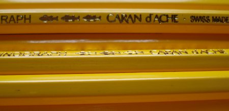
Using terminology we introduced last month in our review of the Castell 9000, the pencil is marked in gold lettering:
Side 1 (Obverse): TECHNOGRAPH [logo] CARAN d’ACHE SWISS MADE 777 HB
Side 2: blank
Side 3: blank
Side 4 (Reverse): HB
Side 5: blank
Side 6: blank
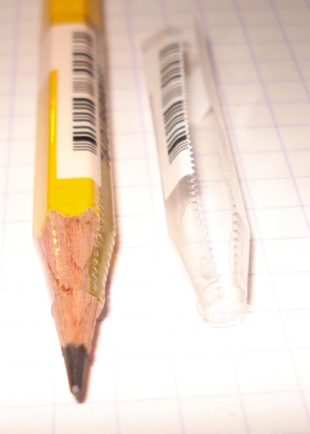
I like this sparse look much more than that of pencils with two or three sides filled with text. So where’s the ubiquitous barcode? Caran d’Ache has preserved the looks of the pencil by putting the barcode on a removable perforated plastic wrapper. It would be great if others would imitate them.
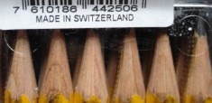
The pencils felt light to me. I put them on the scale. They ranged from 3.5g to 4.4g, with the mean being 3.8g. That’s identical to the reference Staedtler Mars Lumograph 100 mean weight, so I was wrong. My new theory is that the absence of markings on the pencil makes them easier to hold, with much less effort needed to get a comfortable grip, and that this may make them feel lighter.
As pencils – I note they come in a wide range, but I’ll just mention the HB here – I tried to compare them with the Staedtler Mars Lumograph 100 and Faber-Castell Castell 9000 on a variety of papers. Every time I thought that I might have found a difference, I found some variation in the testing conditions. Though I’d like to post “Pencil X makes lines like this” photos or scans, there seem to be a great number of variables that influence the line created, and the results can be faulty. Have you heard that in a stereo store, the loudest system will sound the “best” to most people, or that when the New Yorker blindfolded professional wine critics, simple distinctions like white vs. red couldn’t be discerned?
What I can say is – the HB versions of these three highly regarded pencils make relatively similar lines, and that’s a high standard – this is all good news!
So if you get a chance, do try them out!
I’d like to thank two other pencil blogs that have reviewed this pencil:
Blyantsiden (In Norwegian)
and
Kent’s PencilLog (In Korean)
Though I can’t read either, I still feel I’ve benefited.
