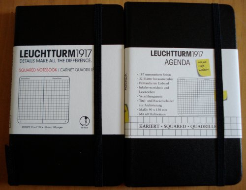
Here are two Leuchtturm notebooks. One sourced in Canada, one in France.
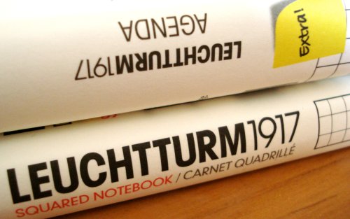
Leuchtturm (meaning “lighthouse”) is a German philately and numismatic supply company founded in 1917. Among their offerings are specialty supplies for collectors – a particular item I find very intriguing is an album for collecting the metal capsules that crown Champagne corks! Who knew? And who retains that sort of collecting determination after downing a bottle of Champagne?
These are pocket sized notebooks with hard covers. They have an elastic enclosure band, a page marker ribbon, and a pocket inside the back cover.
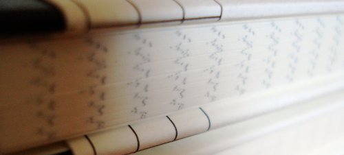
They also have a feature that I love – numbered pages and a blank index section! This is a great solution to the problem of finding what one has written down. Plus, the numbers look like they belong, using the same font and ink colour as the rest of the text. There are laboratory and accounting notebooks with this feature, but many that I’ve seen appear as if they were stamped via a separate and unrelated printing process.
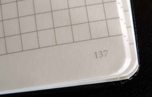
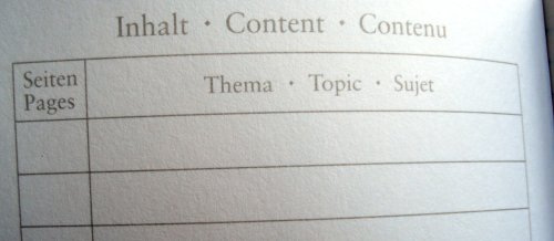
So congratulations, Leuchtturm. Page numbering is one of those little things which makes all the difference. For me, it’s a great benefit because I do write down things that I want to quickly retrieve later.
Here’s what I’m puzzling about. My two notebooks have a number of differences:
– Both are 90x150mm, but the Canadian one has 185 pages, while the French one has 187 pages. The interiors are physically the same, but the arrangement of blank pages around the index varies.
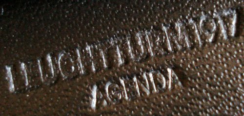
– The French version is stamped Leuchtturm 1917 Agenda, while the Canadian version is simply “Leuchtturm 1917”.

– The last eight pages of the Canadian version are detachable (starting at page 171), while 32 pages of the French version are detachable (starting at page 125).
– The French version came with 60 sticky notes on a card that fits nicely in the back pocket. The card’s back side has a ruler, and some unit conversion tables – a nice touch.
– The page lining imprint is remarkably different. Though the same pattern, The Canadian version is subtle and faint, while the French version is strong and bold. It’s hard to say if it’s just a difference between print runs.
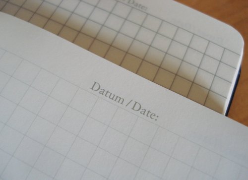
In either variant, they are nice notebooks. Leuchtturm has other sizes, as well as a lattice or dotted grid format that I’ll show another day. I’ve been using a Graf von Faber-Castell pencil in the Canadian version for a few days, and have encountered no problems.
[Update: December 2, 2009]
I asked Leuchtturm about this, and the ruling differences represent different generations of the product, not regional variations. The light rules are the new format, and are being introduced first in Canada and the US.
My thanks to Leuchtturm for their assistance.
