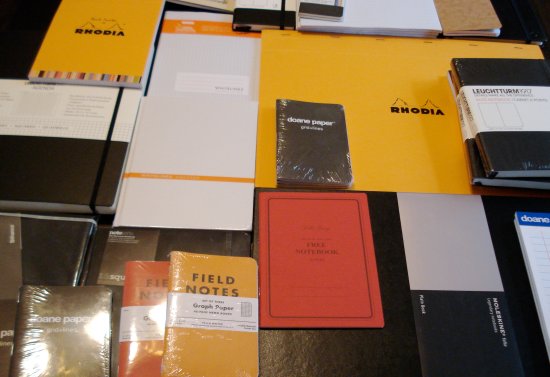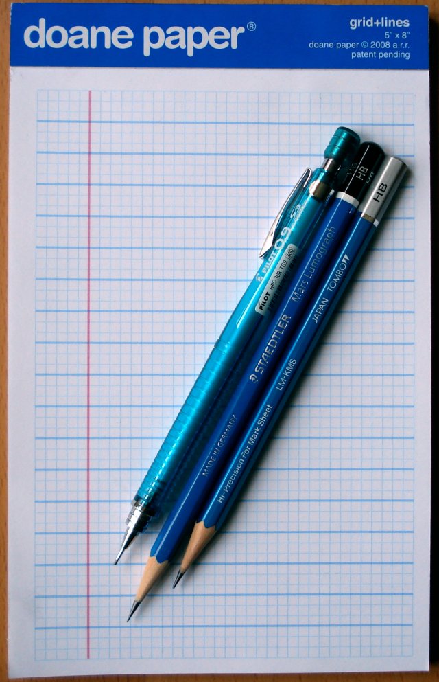
A previous post mentioned a successful stationery shopping trip. One of the brands I picked up was “doane paper”. I had definitely heard of these fine folks via The Pen Addict. The Addict uses doane paper in all his reviews. It may be an addiction. The paper’s grid combines traditional lined ruling with squared (graph paper) ruling.
While the doane paper website offers online ordering, the economics of their flat rate shipping to Canada aren’t too appealing to potential customers who just want to try a pad of paper. It may make sense for large orders.
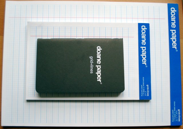
So count me lucky in that I stumbled across one of their few brick and mortar retailers – Laywine’s in Toronto. I picked up packages of the 8.25″x11.75″ and 5″x8″ paper pads and the 3.5″x5.5″ stapled notebook. (1″ = 25.4mm, and I’ll continue to use Imperial measurements here because they turn out to be integral to the product format.)
The paper immediately struck me as appealing in design, as well as offering a nice heft. What I wasn’t so pleased with were the thin cardboard backing and the bright shiny blue top section. The thin back means the pad can only be used on a desk or other solid surface, and the super glossy blue section struck me as being a distraction.
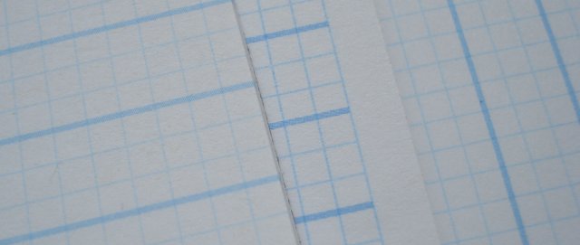
While the paper and layout are very nice, there are a lot of elements that are so “just right” that I have to presume they are the results of careful and thoughtful design.
The paper pattern in based on 1/8th inch squares rendered in fine blue ink. The small pad is 36 squares wide and 54 squares long.
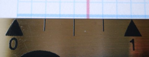
Let’s note two paper design items here:
First, the smaller squares are almost unique. 5mm squares are a stationery norm, from high end Clairefontaine and Rhodia to generic office supply store paper, and the 1/8th inch (about 3.2mm) squares, with fine line rendering, have much more of a precision engineering look and feel.
Second, the squares are contained, and don’t bleed to the edges (see the top two photos). This addresses another problem – quadrille/square/graph paper almost always has the issue of randomness of the application of the ruling pattern. Even Exacompta Record Cards have this issue. (Japanese manufacturers such as Correct seem to have solved the problem, and can consistently apply the square pattern across a given paper format.)
What this means is that is that the grid layout looks more centered and even more precise than almost any other paper most of us typically handle. The doane paper pad appears so precise and exact because it uses smaller squares, and because the squares don’t bleed to the edge.
Next, every third horizontal line is thicker – these are the normal horizontal rules of most paper. The number of vertical squares (54) is of course is divisible by three, so that there are 18 normal ruled sections created by the 17 thick rules.
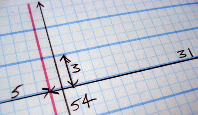
The pièce de résistance is the thick red vertical margin rule. Something in me says it should be six squares in to balance the three squares of the thick horizontal rule section in a 2:1 ratio. But of course it shouldn’t be! It is five squares in – for a 5:3 ratio, approximating the golden mean.
The 5×8 pad in particular, which has 50 perforated sheets, with a detached sheet being 5×7.25, really is a compelling offering.
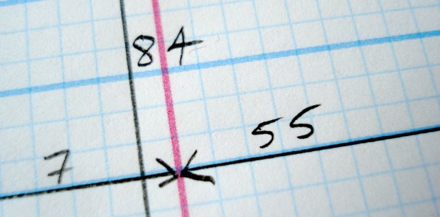
The large pad, which I also like, is 62 squares wide and 84 squares long. The margin line is seven squares in.
The above stated, I’m neither a designer nor a design critic. I was taken with the paper and wanted to try and learn what elements made it so interesting and special. I hope some or much of the analysis is correct.
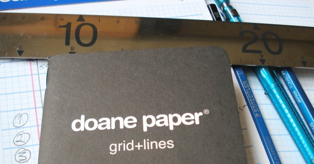
The ‘utility notebook’ was less interesting to me. The cover is very thin, making it unideal as a travel companion. As well, the graph bleeds to the edge and there are no red margin lines – all the elements which seemed most interesting in the pads are absent in the notebook.
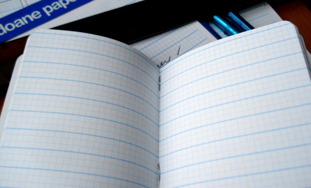
There are other formats as well, but I didn’t see them at Laywine’s.
Now the paper itself seems to handle graphite really well. The sturdy bright white paper and blue lines combine very well with graphite – either ceramic or polymer. A super high quality pencil like the Tombow Mono Mark Sheet just pops on the paper.

I recently used the small pad to help prepare for a presentation, and I found the format to promote conscious, organized note taking. Speaking to an audience, where content and time management are parallel tasks, was a challenge ably addressed by this format. I said to myself, “Content goes on the lines, timing and technical notes on the grid”. I really didn’t have to think about it – it just worked.
For many readers of this blog, I think doane paper is well worth examining. Have you seen it?
