Ampad Engineer’s Computation Pad

Ampad Engineer's Computation Pad

The Ampad Engineer’s Computation Pad is a specialty pad of paper. Light green with green ruling, the front side of the page has only a margin. The back of the page has a 100 by 700 grid, with each square measuring 1/5″ x 1/5″. The inch lines (every fifth line) are slightly darker.

The idea is that graphs and drawings can be made with the benefit of the ruling, while appearing to be on a blank background.

It is a completely different approach to some of the same problems that Whitelines paper is also attempting to address.

As paper, it’s fairly thin and lightweight. It seemed very pencil friendly, and maybe just a tad less amicable towards a medium nib Lamy pen.

Ampad Engineer's Computation Pad

Choices are good. If writing with the intention of line rulings not reproducing was my sole objective, then I’d say the Whitelines paper is much better – using it is pleasant and effortless, while the ruling of the Engineer’s Pad can take some strain to discern. Whitelines also comes in many paper sizes and binding options. On the flip side, the Engineer’s Pad is much easier on the wallet, and each side having a different scheme could be useful.

Faber-Castell Castell 9000 pencil

Faber-Castell Castell 9000 pencil

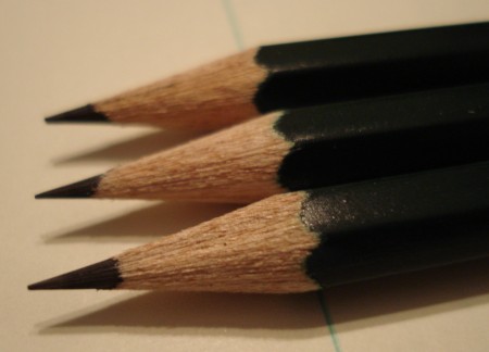
The Castell 9000 is a famous and iconic pencil. A flagship product of Faber-Castell, the world’s largest pencil company, the 9000 has over a century of history as an important working tool of writers, artists and engineers.

The dark rich green (“forest green”) has varied in shade over the years, but the current version is excellent. It makes for a very handsome pencil. It seems similar to the palette used by both Mazda and Land Rover in the automotive field.

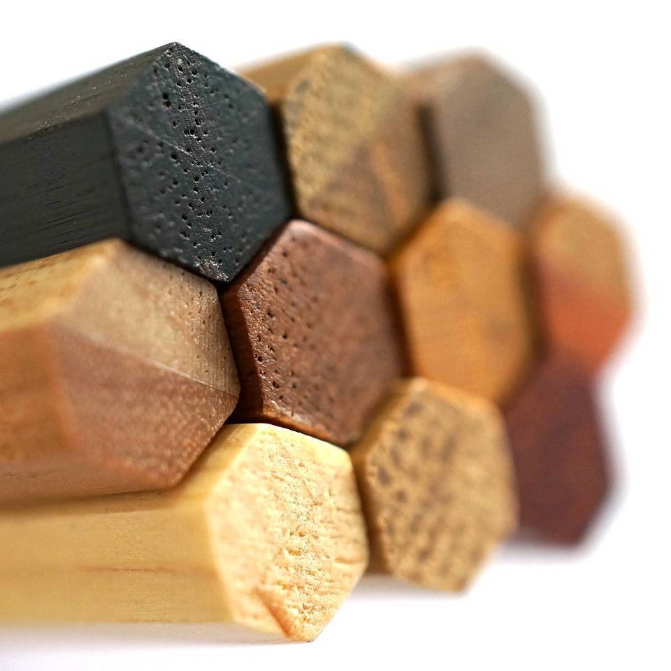
Most 9000 pencils are sold sharpened, without eraser. (There is a variant with eraser.) There is a wide range of hardnesses offered, but today we’ll restrict ourselves to the HB version.

Following the methods mentioned in the Staedtler Mars Lumograph post, I weighed several pencils. The range was 3.6 to 4.1 grams, with the mean 3.9 grams. So it may be a sliver heavier than the Lumograph, our reference pencil. The length is the standard 175mm. The distance between opposite sides in 7.3mm, making it slightly narrower than the Lumograph. Being thinner yet heavier than the Lumograph is presumably due to the wood.

There is only one noticeable physical difference – the hexagonal edges are slightly less rounded on the Castell 9000 than on the Lumograph. I like this, and think it may slightly improve the grip.

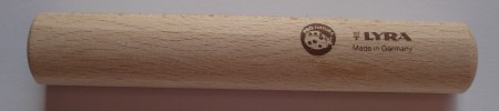
Let’s introduce some terminology to describe the six sides of a hexagonal pencil. We’ve already used the ‘obverse’ and ‘reverse’ terms (borrowed from the numismatic field) in previous reviews.

Side 1: The pencil’s obverse – the pencil’s main markings – usually the manufacturer and model names.
Side 2: The next side, viewed clockwise, from the perspective of the pencil’s cap.
Side 3: Again, the next side of the pencil.
Side 4: The pencil’s reverse, opposite the obverse – often the location of a bar code or secondary information. (e.g. The full model number rather than just the marketing name.)
Side 5: Again, the next side of the pencil.
Side 6: Again, the next side of the pencil.

So with this terminology, the pencil is marked (in gold colouring):

Side 1 (Obverse): Castell 9000 Faber-Castell HB
Side 2: blank
Side 3: 4 005401 190004 [bar code] HB
Side 4 (Reverse): blank
Side 5: Water-based varnish Wasserlack SV Made in Germany www.Faber-Castell.com HB
Side 6: blank

Faber-Castell Castell 9000 pencil

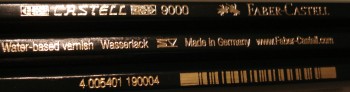
I like pencils with clean looks – and this is just too much writing – three different sides of the pencil, each half covered with text.

It’s a great writer. Side-by-side with the Lumograph, the Castell 9000 is just a touch harder and lighter. The point seems unusually good at staying sharp. In B, right up to 4B, the pencil becomes buttery smooth.

I’d like to be able to better describe a pencil’s marking capabilities, but this is a challenging problem for which I haven’t found a satisfactory solution – the pressure used, the angle of application, the shape of the lead prior to use, and the paper are all important contributing variables. Paper can be standardized, but the other factors probably require special equipment to reproduce. I presume pencil companies have this type of equipment (a pencil gripping robot?) for their testing.

Perhaps the best endorsement is the century of commercial success experienced by the Castell 9000.

If you’ve somehow avoided this pencil – pick up a few to try. I doubt you will be disappointed.

Some additional reading:

November 2005 post at pencil talk

Faber-Castell pages on the Castell 9000

Leadholder.com page on these pencils, including links to historic catalogs. An excellent source if you’re seeking to date a particular pencil or learn more.

Michael Leddy’s essay on the 9000.

The Rolodex lives on!

My morning paper has a great piece on the Rolodex, though I’m not sure I like the phrase “Stone Age”.

I agree with the description of today’s desks. In my only job that supplied a Rolodex, I do recall having magnitudes more work space than today’s offices tend to provide.

Lyra Ferby pencil extender

Lyra Ferby pencil extender

I’ve written before about the Lyra Ferby. I think it’s a great pencil that deserves more recognition. For a start, the artists who enjoy the Koh-I-Noor Triograph should give the Ferby a try.

But there has been a problem with the Ferby – as a short pencil, it won’t remain usable after a dozen sharpenings. Well, I just discovered that Lyra makes a pencil extender for the Ferby. (Shown above.)

The extender’s form is very simple – a wood cylinder.

While it was fun to discover this item, I’m afraid that I find this extender awkward and unwieldy. There also appears to be a better solution – Lyra makes a full length version of the Ferby, called the “Super Ferby”! Unfortunately, I’ve never seen them for sale. But I’ll keep my eye open!

The (in)convenience of online ordering

Canada Post Final Notice

I’m often asked how to “order” a pencil or stationery item featured on my blog. Though online ordering can appear to be a great convenience, sometimes that’s not the case. We may simply be postponing our inconvenience.

The photo shows a Canada Post “Final Notice” – more on this later.

Some years ago, sending an item by courier, even to a residential address, was a serious transaction. If the address had a minor error, if you were out, if there was bad weather, it didn’t matter at all. These were the challenges that were accepted as part of the service – the reason one paid a generous surplus over postal delivery.

Today, basic courier services (used by a broad wealth of online retailers) offer almost no “service” at the final stage of delivery. Though they may charge up to $20 (US or Canadian), this includes one or zero visits to the destination, with a “notice” postcard (or similar) left. You then have to go to the outlet/office of the courier to get your item.

For anyone with a day job (possibly a good percentage of those buying online) – this can be the “inconvenience” part. Though the photo shows a Canada Post notice, I equally include Purolator, UPS, and Fedex. Getting one of these notices and being told that I have X business days to appear and claim my package at a remote, out of the way office is always inconvenient and stress inducing.

Preferable is a higher level of service, such as when I’ve ordered items from France or Malaysia, and found a DHL courier at my doorstep in the evening. (“We check if an address is residential, and if it is, try the customer in the evening.”, a courier said. That was enlightening. It should be more common, but it isn’t.)

Or – regular postal delivery – a box of pencils in the mailbox, the value of which doesn’t merit the courier surcharge.

Upfront, click and point ordering is clearly convenient, but all that has happened is that my trip outside the house has been delayed. And the trip is not to a nice local stationery shop – my visit will be to a lineup in a grim faceless suburban courier depot.

The flip side, retail purchasing at a store, has lots of merits. You can see the true colour of an item. You can explore the texture. You can feel it’s weight. If it’s something like a fountain pen, you can dip it and see if you like how it writes! You can even talk with a real fellow human being.

It may be more expensive than buying from an online vendor who has no main street commercial rent to pay, but today we often pay for convenience – and what’s more convenient than this – being able to examine an item in detail – and should it meets your needs – pay for it and walk away with it.

So anyhow, I’m hoping there will soon be a snowstorm free evening here. I just received a final notice for a waiting package.

Seed HeshIQ 01 Eraser

Seed HeshIQ 01 Eraser

These are a set of nine “L”-shaped erasers from Seed of Japan. (Shown on Strathmore 400 Series Artagain black paper.)

The nine erasers together form a 3x3x3 cube. If you search the web, you’ll see that this is an example of a range of tiling/puzzle/cube problems that have attracted interest over the years. Mathematician John Conway is especially well known in this area.

Though interesting, I wish that the eraser pattern was a little more challenging to reassemble.

The erasers are good quality white vinyl, though probably impractical for frequent use. Of course with the pieces scattered on your desk, one will likely always be in sight, so there are merits.

If you like this sort of amusement, here’s my favorite online tile puzzle: Quzzle. I’ve neither solved it nor lost interest.

I also recommend browsing around the Seed site if you’re interested in erasers. They appear to have some very interesting products which unfortunately aren’t yet widely available outside Japan.