Earlier this year, we noted an interesting article on the current state of the pencil industry.
From Time Magazine’s archives, here is an overview published in 1932.
pencil talk | pencil reviews and discussion
exploring the art and science of pencils since 2005
Earlier this year, we noted an interesting article on the current state of the pencil industry.
From Time Magazine’s archives, here is an overview published in 1932.
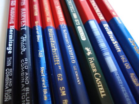
Well, I now have a Conté Television 649 red and blue pencil, as well as three other members of the elite red and blue pencil cadre.
The pencils are the Television 649, made by Conté in France, the RotBlauStift 162 00 from Cretacolor, made in Austria, a Koh-I-Noor 3423, origin unstated, and a Castell 873 Color by Faber-Castell, made in Germany.
The RotBlauStift is a regular sized hexagonal pencil, while the other three are oversized hexagonal pencils.
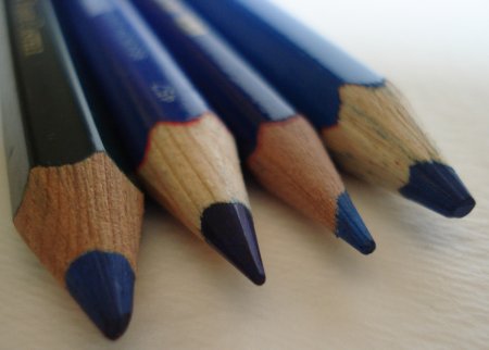
A few notes:
– Faber-Castell is definitely the rebel here, eschewing the standard red and blue for their signature forest green. I wish they hadn’t done this. There are occasions when respecting a tradition should trump branding concerns.
– The Koh-I-Noor has exceptionally utilitarian markings, with the name imprinted via something akin to a dot matrix printer.
– The Television’s wood has the same sort of look as the Grip 2001 pencil – jelutong or pulai.
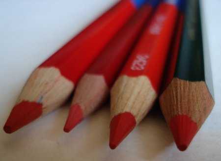
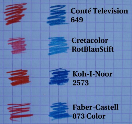
As with our previously examined red and blue pencils, there is a range of colours – the Cretaclor is light in both red and blue, the Koh-I-Noor bright and rich in both, and the others somewhere in between.
Here are trial results with the four new pencils:
Let’s summarize the main features of the red and blue pencils that we have looked at so far:
| Manufacturer | Model | Shape | Oversize | Core |
| Conté | Television 649 | Hexagonal | Yes | 4mm |
| Cretacolor | RotBlauStift 162 00 | Hexagonal | No | 2mm |
| Faber-Castell | Castell 873 Color | Hexagonal | Yes | 4mm |
| Koh-I-Noor | 3423 | Hexagonal | Yes | 4mm |
| Koh-I-Noor | Bürofarbstift 62 | Hexagonal | No | 2mm |
| Musgrave | Hermitage Thin 525 | Hexagonal | No | 2mm |
| Musgrave | Harvest Thick 725 | Round | No | 4mm |
| Prismacolor | Verithin 748 | Round | No | 2mm |
| Schwan-Stabilo | Stabilo 8742 | Hexagonal | No | 2mm |
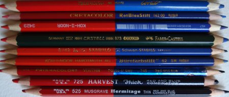
These traditional pencils associated with teaching and accounting still have a strong resonance. While the keyboard has supplanted pens and pencils in many areas, it is fascinating that this sub-specialty of the woodcase pencil still continues. All of these pencils shown are in active production by their manufacturers.
Further reading:
Red and Blue pencils (February, 2008)
Red and Blue pencils II (March, 2008)
This page at stdk.de, which has documentary quality photographs of several red and blue pencils, plus a list of known red and blue pencils in production.
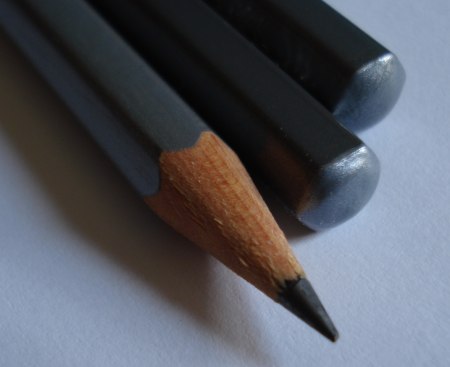
The Caran d’Ache Grafwood pencil is intriguing.
The pencil is a rounded hexagonal shape, a millimetre or two wider than the Technograph.

It has a silver finish, with the very interesting feature of the finish colour corresponding to the lead degree – lighter pencils in a lighter silver, and darker pencils in a darker silver. Each pencil degree is slightly different. This is a great feature, and a huge advance over a degree marking (e.g. ‘B’), possibly hard to read, on the pencil. Of course, this comes at a price to the consumer.
These pencils remind me of Derwent’s offerings. I am remiss in not yet having written about a Derwent pencil here, though I regularly use them.

Derwent has a ‘Graphic’ line, and a ‘Sketching’ line. The Graphic pencil is hexagonal, in a typical pencil diameter. The Sketching pencil is round, slightly larger, with a larger graphite core. The idea is that the form factor supports rich lines and easy freehand drawing.
The Grafwood is similarly conceived – a larger diameter pencil (though hexagonal), for easy grip and sketching. Visually, it appears to have a larger than standard (i.e. 2mm) core, but I don’t really want to sacrifice one of the few I have just for dissection.
The lead seems to be at least of the same calibre as the Technograph, and possibly better.

At a 2B grade, the graphite seems to be much more solid and non-crumbling than the corresponding Derwent pencil, while giving just as dark a line.
I really like these pencils, and I encourage Caran d’Ache to seek more distribution for their products – I haven’t yet seen anything from their graphite pencil line that isn’t first rate.

The Eagle Draughting pencil is a treasure from the past.
The pencil is round, with a core just over 3mm in diameter.
It has a dark wood stain, and is imprinted:
Made U.S.A. [logo] EAGLE “Chemi*Sealed” Draughting 314
This pencil is absolutely delightful to use – it has a super smooth creamy black lead, with great historic style. The lead does wear down quite quickly, so a nearby sharpener can be handy at times.

I am a bit curious about how it is a “draughting” pencil. More recently (this pencil may be several decades old) a drafting pencil has typically had a hard, faint lead. This would be sold as a pencil for artists, were it sold today.
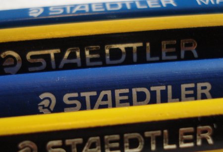
Staedtler is one of the two leading global pencil manufacturers. I thought it would be interesting to look further at just what their pencil offerings are.
I took a look at the twenty-two national sites referenced by staedtler.com.
Globally, Staedtler offers twelve pencils in four lines. Most European countries get the full range, and the rest of us are offered a subset.
The premiere line, Mars, is composed of the famous Lumograph, and ancillary Stenofix and ergosoft variants. “ergosoft” actually refers to the triangular shaped pencils with rubbery coating – there are other non-Mars ergosoft pencils (Noris, colouring pencils, etc.).
The second line, tradition, is especially interesting, because it is currently being made in both Germany and Australia. The Australian plant also makes a variant with an eraser.
The Noris is the student line, and has six versions.
Finally, the Minerva, whose country of origin isn’t mentioned, is the discount pencil. This is apparently Staedtler’s oldest surviving pencil brand.
I suspect these offerings reflect the importance of children in the marketplace.
Some national sites also show other pencils. Australia and Thailand both have large lists of additional pencils, while the U.S. lists non-repro and non-print pencils from Staedtler Austria. (Which aren’t on the Austrian site.)
While interesting, some pencils – the Norica, the Rally, the Cadet, etc., are not on the wesites as far as I could determine.
By model number, the pencils are:
100 – Mars Lumograph (hexagonal)
101 – Mars stenofix (round)
110 – tradition (hexagonal)
118 – Noris Club triplus (triangular)
119 – Noris Club triplus jumbo (triangular, oversize)
120 – Noris (hexagonal)
122 – Noris (hexagonal, eraser)
130 – minerva (hexagonal)
150 – Mars Ergosoft (triangular, rubber coating)
151 – Mars Ergosoft (triangular, rubber coating, oversize)
152 – Noris Ergosoft (triangular, rubber coating)
153 – Noris Ergosoft (triangular, rubber coating, oversize)
Overall, it is an impressive range. I wonder how many retailers actually carry all twelve pencils?

Last week’s eraser test didn’t reveal good results for the Pink Pearl eraser. But the Pink Pearl doesn’t have to worry, because it is more than an eraser. It is a cultural icon.
It is not unlike the pencil in Petroski’s The Pencil – mysterious and undocumented, yet pervasive.
Erasure is about the correction of one’s mistakes – a lofty goal in life. Yet like the Pink Pearl, the effort doesn’t always succeed.
Jason Crane’s portrait of the Pink Pearl pays homage to this cultural instrument. A limited edition of 53, it is a large print that occupies over seven square feet. It could be an inspiration to a writer, visual artist or anyone facing a creative struggle.
Apart from the Dixon Pink Pearl, I have a box of 36 vintage Eberhard Faber Pink Pearls:
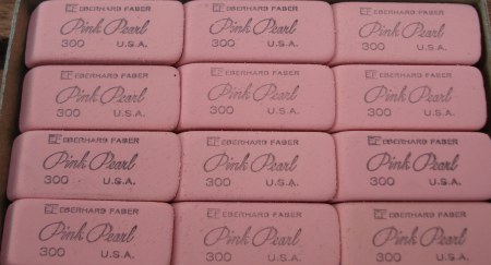
They’re cool, but not as cool as Jordan Crane’s print.