Be sure to visit the Carnival of Pen, Pencil and Paper.
The Carnival is an anthology of blog posts on stationery and writing implements, and a piece from pencil talk was selected as an “Editor’s Pick”. Thank you!
pencil talk | pencil reviews and discussion
exploring the art and science of pencils since 2005
Be sure to visit the Carnival of Pen, Pencil and Paper.
The Carnival is an anthology of blog posts on stationery and writing implements, and a piece from pencil talk was selected as an “Editor’s Pick”. Thank you!
These novelty pencils match the format of the Penguin Classics series.
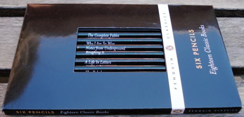
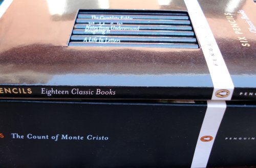
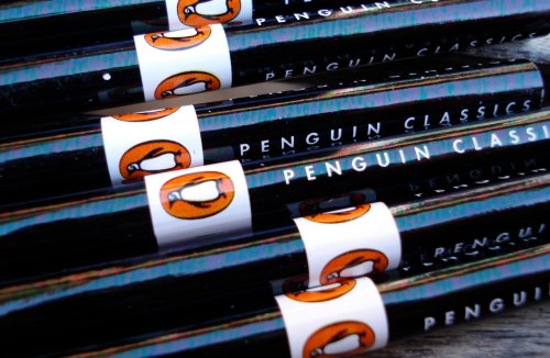
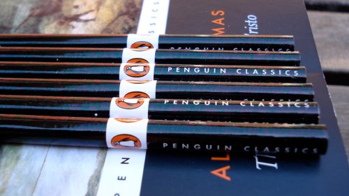
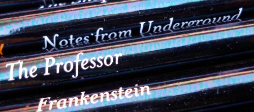
Accompanying a Penguin novel, they would make a great back to school gift for a student.
“A pencil that is right some days is no good another day. For example, yesterday, I used a [Blackwing] soft and fine and it floated over the paper just wonderfully. So this morning I try the same kind. They crack on me. Points breaks and all hell is let loose.”
-John Steinbeck on his search for the ideal pencil
The Blackwing 602 was not a commercial success – despite praise from novelist John Steinbeck and mentions in Henry Petroski’s The Pencil, Sanford discontinued the pencil in 1997 due to lack of sales.
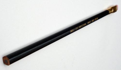
The story of the pencil’s demise is in a 2004 article at The Pencil Pages. The eraser clasp machine broke, and supply ran out. Why not fix the machine? At sales of just over a thousand boxes a year, the Blackwing had become a marginal brand, and was allowed to lapse.

It’s hard to get a fix on current supply and demand. They seem be regularly for sale on eBay, year after year. A modern pencil, out of production for only a decade, the Blackwing has become highly collectable – selling for $20 to $50 (or even more) per pencil.

A gentleman (and pencil user) from Missouri kindly sent me a Blackwing for inspection this past week. My thanks to him.
The pencil has an unusual ferrule. Up to the 1940s, pencils had more variety in ferrules/erasers (many examples at Brand Name Pencils), but modern production techniques have standardized these interesting varieties. The Blackwing’s ferrule has a gold colour, and presents a rectangular wedge. A family member who paints immediately thought it was a paintbrush clasp.
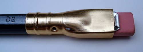
The wedge allows the insertion of a small block eraser. I won’t test the original (and now dry) decade old pink eraser, but the format does allow one to slice replacement pieces from a regular block eraser – an idea I like.

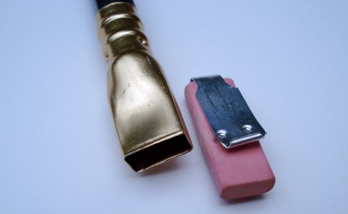
As charming as the novel ferrule/eraser looks, it seems a terrible idea. First, it distorts the pencil’s natural dimensions. Standard pencils, from the 19th throught the 21st centuries, are about 175mm. The Blackwing is about 200mm including the eraser.

Possibly even worse – the Blackwing’s balance point is quite wrong for a pencil. A standard quality pencil’s point of balance is at the halfway point. But for the Blackwing, it is about 70% up the pencil’s length. As the pencil is sharpened, that proportion will become more extreme.


The reason is that the pencil weighs 5.3 grams – with the eraser/clasp weighing 1.1g. 20% of the pencil’s unsharpened weight is at the cap – and increasing as a percentage as the pencil gets sharpened.
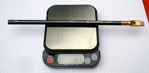
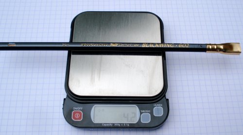
Unless the Blackwing is your only pencil – it is too different from standard pencils to make an easy adjustment to the odd balance.
The pencil is a smoky grey. I like it, and see why others agree.
The obverse is labelled:
USA Woodclinched EF logo Eberhard Faber Blackwing 602
As well , “DB” is impressed into the wood. Any idea what this code refers to?
The reverse has the great slogan:
Half the pressure, twice the speed
I sharpened the pencil in the Carl Decade DE-100. As much as I love pencils, I don’t love most pencil sharpeners, and Carl’s products are great exceptions.
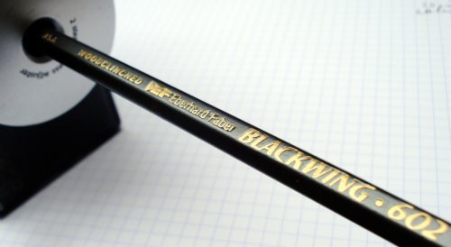
The Blackwing sharpens very nicely, as expected.
On paper, I tried the pencil on a Rhodia pad.
I’ll admit my first surprise – the blogosphere’s perspective on pencils is that that dark rich lines are the best – and the Blackwing seemed quite middling in the category. Okay, mabye not middling – much better than the vast majority of pencils – yet as a pencil that some claim should rest on a throne – it seemed to leave a lighter mark than other top pencils.
The smoothness category may be the key to understanding the Blackwing – the pencil is not smooth – it is more like slippery – floating on paper without tension, but not creating an appreciably dark line. The wax content in the pencil is a main feature.
I also tried erasure – with a Staedtler Mars, it seems to outperform other pencils, erasing very cleanly.
Some darker pencils like to draw outside the lines – emitting crumbles and residue – but the Blackwing excels in staying put!
The Pencil Pages article mentions the Blackwing’s putative successors, and I thought I would try them out as well.
A distinction to be noted – we are told that the Blackwing is a 4B grade lead – but quality pencils ranges today vary the lead diameter with the lead grade – softer lead grades having wider diameters – so these other pencils may have an advantage.
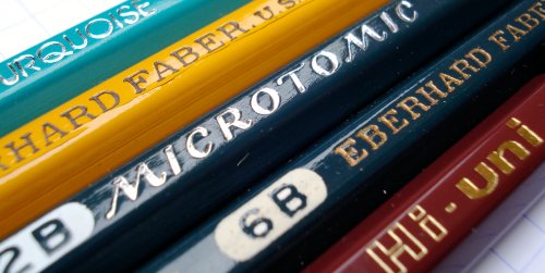
The Turqouise 4B is good, but it doesn’t strike me as being of the same calibre in any sense.
The Blackwing’s lead apparently carried on in the Microtomic (another lapsed label/brand). There are various ‘Microtomic’ pencils – some principally labelled as Microtomic, and some from another principle brand, with “Microtomic” used as an adjective. Some research on the name is here.
I have a few laying around – they typically have have attractive packaging, and I have variants in 2B, 5B, and 6B – but not 4B.
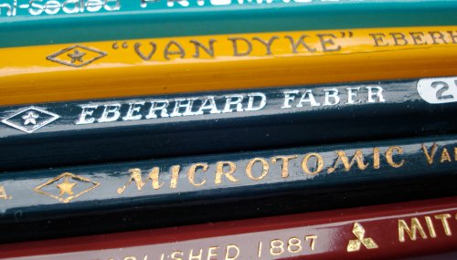
This test left me wondering why I hadn’t previously sharpened them. The Microtomics lay down a superb pencil line. The 2B is exceptionally smooth, and capable of reaching extremely deep shades. The Microtomic line seems perhaps less smooth and waxy than the Blackwing, yet is still an equally worthy pencil.

Another line of enquiry that of course occured was – how does the Blackwing compare with modern pencils?
Modern pencilmaking’s best efforts seem to occur in Japan, and I selected the Mitsubishi Hi-Uni 4B as the main comparison pencil.
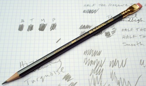
Tests were also conducted with the Tombow Mono Special 6B, Craft Design item 17 HB, Tombow Mono 4B, and Kitaboshi Hit 4B.
The Blackwing is in the middle at darkness, it excels at erasability and crumbling resistance, and is also in the middle at smoothness. It isn’t really a peer of the top modern pencils.
This test may be like comparing the automobiles of 1968 to those of 2010 – the past achievements are acknowledged and celebrated, but decades of engineering advancements just can’t be overcome.
The Blackwing 602 was great in the climate of it’s time, but died through lack of support. With Sanford’s pencil production leaving the US this year, the Blackwing is definitely not returning. If you love quality woodcase pencils, now is the time to support today’s Blackwings – the top products from Kitaboshi, Pentel, Tombow, and Mitsubishi.
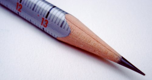
A companion to Eberhard Faber’s geometry pencil, this is a triangular shaped pencil that mimics an architect’s scale.
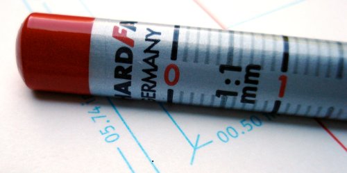
Though I have only one, I did sharpen it! It is a delight.
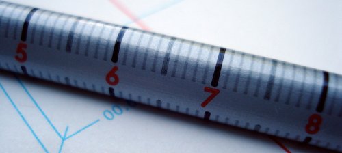
My thanks to Gunther from Lexikaliker for sending me this pencil!
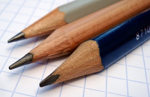
Bruynzeel is a Netherlands pencil and art supply brand, now owned by Sakura of Japan. A couple of years ago, we took a look at the Bruynzeel High Grade pencil. Today, we’ll look at three more pencils:
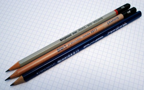
The Triple Grip is a triangular pencil, just slightly oversized. I like the shape and dark blue colouring quite a bit.
The design pencil 8615 is hexagonal, and finished in grey, with a black cap and red cap ring.
The design 8815 is round and has a natural finish, with black cap.
The two design pencils are also marked “Holland”.
The Bruynzeel name has a different font on each pencil. Maybe the name is considered distinct enough to not require consistent branding?


The two design pencils write quite nicely (much better than the High Grade), while the Triple Grip unfortunately is just average. I would say the 8815 stands out as another rare example of a high quality round pencil.
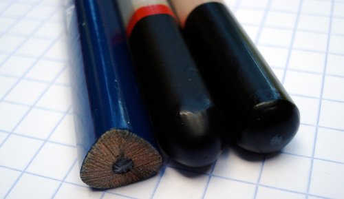
My thanks to blog reader Huib for sending me these pencils.

The lead pencil’s main ingredients haven’t changed much since Conté and Hardmuth figured out how to blend and bake clay and graphite approximately two hundred years ago.
Yet a few pencils acknowledge getting a bit of help from mixing in some charcoal, and some others are a bit more mysterious. Of course there are also pencils that clearly identify their marking ingredient, whether graphite, charcoal, or chalk. Here are a few pencils labelled “Carbon” or “Ebony”.
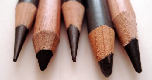
Maybe you use one or more of them? If so, maybe you can share a little about why you like the pencil.
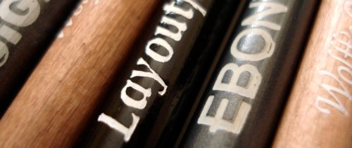
The Sanford Ebony Design 14420 is described on the packaging: “Thick, jet black lead produces expressive images with a matte finish.” To me, “jet black” is an exaggeration. The pencil has an oversized graphite core, and seems to be a typical pencil, but with a soft grade that keeps a point quite well.
General’s Layout/Ebony pencil 555 is described on the General pencil website as being “extra smooth, extra black graphite.” It also appears to be an oversize core pencil in a soft grade.
Both are nice pencils, but the “ebony” designation seems to be more a term meant to connote this pencil style, rather than referring to any specific formula. Pencils available in a wide range of grades usually use larger cores for the softer pencils anyway, so the uniqueness isn’t so clear.
They also reminded me of oversize core pencils from Japan – both Tombow and Mitsubishi offer 4B and 6B pencils with oversize cores. Derwent and Caran d’Ache are also known for oversize core drawing pencils.
Lyra Rembrandt Carbon 308/3 is one of a few very interesting specialty pencils found in the Lyra “Art Specials” set. The Carbon 308/3 is apparently a charcoal and grease pencil – but you could have fooled me. It doesn’t have that crunchiness or light weight of compressed charcoal. On the other hand, it does leave a dark matte finish. I think it’s very interesting, and suspect it is a graphite/charcoal blend.
General’s Carbon Sketch 595 is, according to General, “The perfect combination of charcoal and graphite.” It also has a metal cap. I found it to leave an intense dark black line while again not having that charcoal compacting aspect. Anyone wanting a deep black, matte line should investigate this pencil.
The Lyra 309 is apparently “carbon without grease”. Here I’m wondering if the translation was in error. While the 308 was labelled carbon, the 309 is not, and seems more like just a charcoal pencil.
Wolff’s carbon Royal Sovereign 2B is another very interesting mixed ingredient pencil. Perpendicular to paper, it seems to squeak when it moves!
Staedtler’s 7B, 8B, and EE pencils also seem to fit in this category.
There are no doubt other examples.