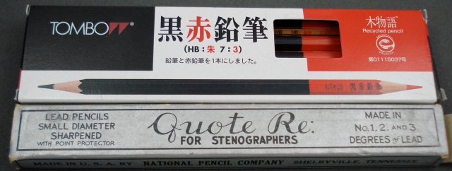
It looks like the fantastic Tombow Black Red LV-KEV pencil had at least one predecessor.
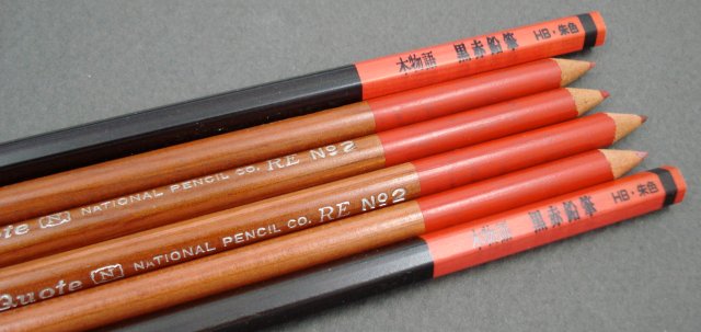
The National Pencil Co. was the location of a 1915 murder that is still resonating.
pencil talk | pencil reviews and discussion
exploring the art and science of pencils since 2005

It looks like the fantastic Tombow Black Red LV-KEV pencil had at least one predecessor.

The National Pencil Co. was the location of a 1915 murder that is still resonating.
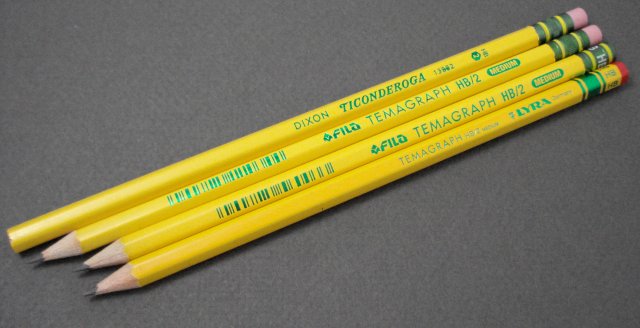
Made by the FILA Group, these pencils from subsidiary brands appear to be roughly the same. They are made at FILA’s main plant in China, and sold under established national brand names. Very established brand names – LYRA (Germany) dates from 1806, and Dixon (USA) from 1795. FILA itself is a relative newcomer, established in 1920.
The Dixon Ticonderoga seems to be the model for the others. It looks just like predecessor versions, minus the “U.S.A.”
The FILA Temagraph is an established brand, but it has been redesigned to resemble the Ticonderoga. The version with an eraser is pretty much a Ticonderoga clone. The one without eraser has an interesting metal cap, with the grade in large letters. It carries on the Ticonderoga ferrule look in an alternate form.
The newest of the bunch is the LYRA Temagraph. The cap has a splash of colour, and is part of a scheme used by other LYRA pencils such as the Robinson. Though the box says the pencil is made in China, the pencil itself is stamped “Germany”.
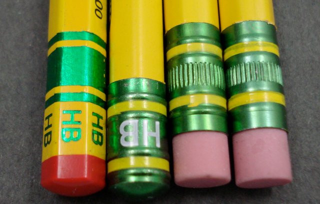
Though they look roughly alike, the pencils seem to have different cores.
Are there others in this series? Do you like what FILA has achieved with this pencil line?
Update: November 18, 2010 There is indeed at least one more! Please see AMOS DIXON Ticonderoga at Bleistift.
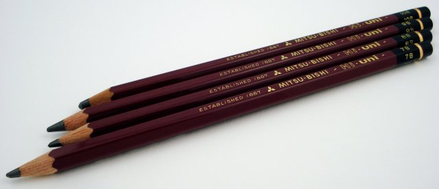
For drawing and shading, the super dark marks of the softest grade pencils can be very appealing. These soft grades typically go up to 6B in the ranges of many manufacturers. Anything beyond that can be very hard to find, especially as a traditional graphite pencil.
Some manufacturers offer very dark pencils in “carbon” or “ebony” lines – but these are typically composed of charcoal, carbon (soot or lamp black), or oil based, rather than graphite.
And some pencils that use the traditional B grades, like the Staedtler Mars Lumograph 100 7B and 8B, are carbon based pencils.
Tombow stops at 6B, as did Mitsubishi – until 2008, when they added 7B, 8B, 9B, and 10B to the Hi-Uni lineup.
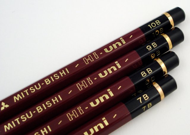
On Strathmore Bristol 300 series 260gsm (100lb) paper (acid free, white, smooth), trying the new Hi-Unis is like tasting county fair caramels – they are all amazingly smooth and delicious. The 9B and 10B have decidedly wider cores. On this paper, and others such as Fabriano Disegno 200gsm (94lb) paper (acid free, toothy), I have trouble really seeing any greater saturation or darker line among the various grades.
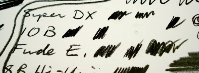
I think these pencils provide a really interesting and satisfying experience, which I recommend to anyone seeking to lay down exceptionally dark lines.
Now the above are the mainstream pencils – but there are (at least) three others. The fude enpitsu (brush pencil) is a gold finshed 10B pencil with a Hi-Uni cap. We took a look at it in 2008. I still agree that it a has a waxier feel. On paper, it may be just a shade lighter.
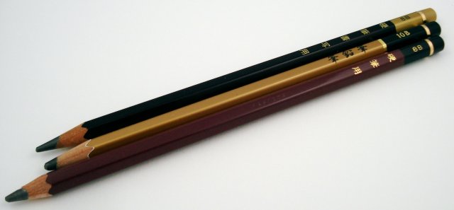
The Super-DX remains an amazing specimen of pencilcraft – the finish is just astounding. As noted previously, it has a very wide core. And a couple of years after first looking at the Super-DX, I still find it to be smoother than the “regular” 8B Hi-Uni, and the lead possibly just a degree more saturated.
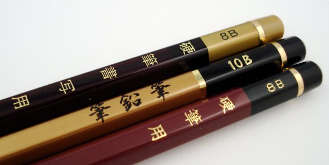
There is one more – a “secret” Hi-Uni 8B that predated the official 2008 extension of the Hi-Uni line. There is some background information at Brand Name Pencils. The “Kouhitsu Yo” has different markings and a wider core than the new 8B Hi-Uni, but otherwise seems to be the same pencil.
If you understand Japanese, it would be greatly appreciated if you could advise on the meaning of the text on these pencils.
Close up, the cores of course look very different from office/school pencils:
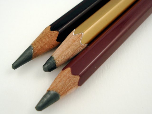
If you’ve used any of these super soft grades, please share your thoughts!
Related reading:
Mitsubishi 10B pencils: the brush pencil (fude enpitsu) and the Hi-uni (pencil talk, November, 2008)
Mitsubishi Hi-Uni Super-DX and Hi-Uni 8B pencils (pencil talk, November, 2008)
Mitsubishi 10B – Part 2 (Dave’s Mechanical Pencils, October, 2008)
Mitsubishi Hi-Uni 10B premium wooden pencil and Pencil Extenders (Lung Sketching Scrolls, December, 2008)
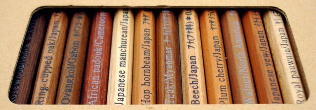
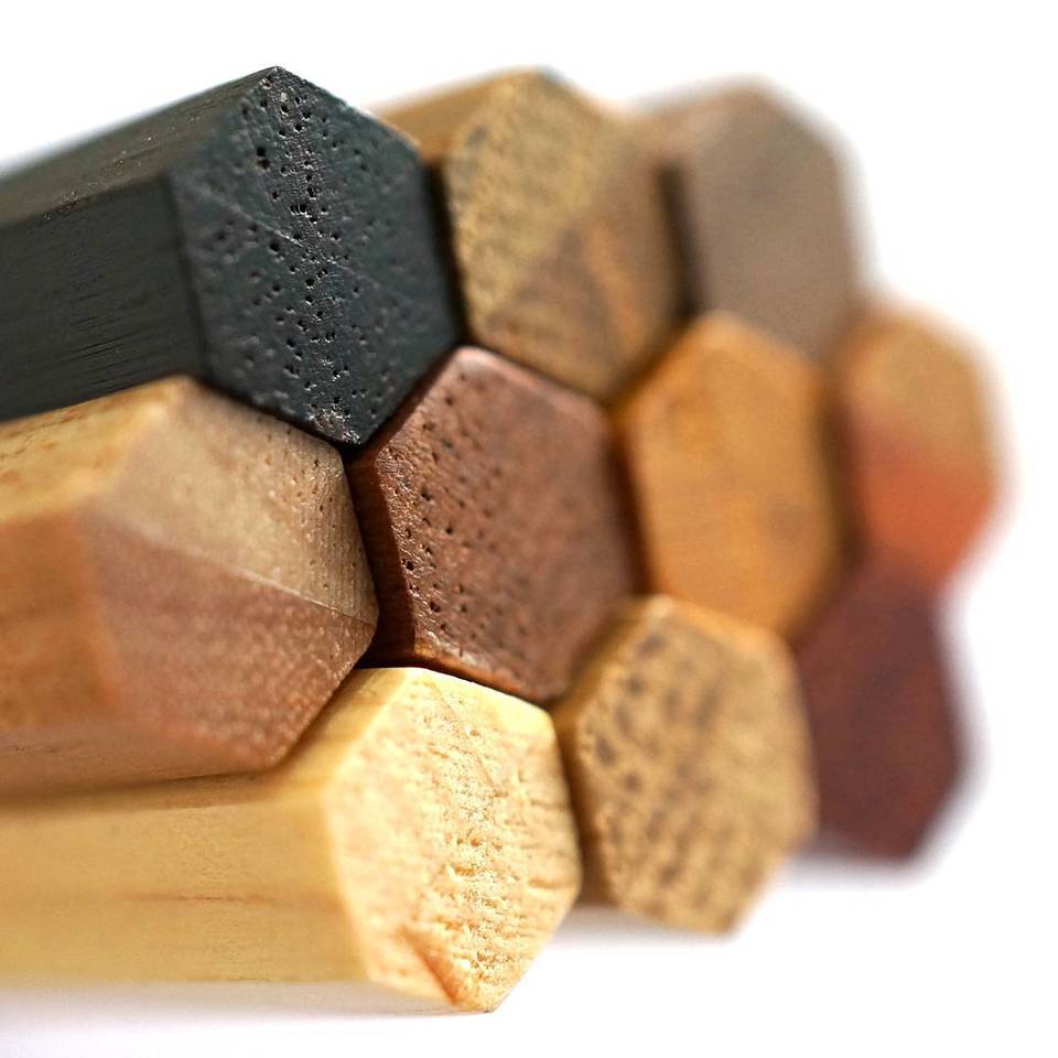
Here are some pencils that I never thought I would see in person – the first volume of the Colleen Woods series.
An amazing masterpiece of pencil making, each pencil in the series of twenty-four (two volumes of twelve) is made from a different species of wood.
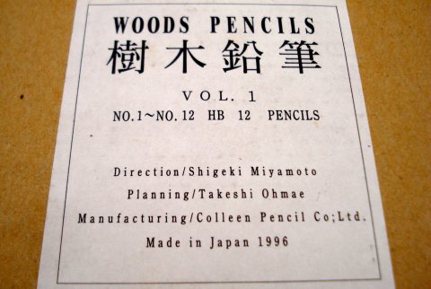
The set is just breathtaking.
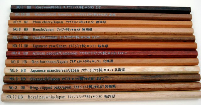
Each pencil notes the specific gravity of the wood. Pencil no. 1, made of Indian Rosewood, is the densest at 0.93.
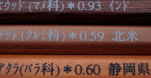
Three of my favorites:
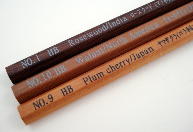
Please also see: Colleen Woods Pencils from June, 2009, which features Volume 2 of the set.
Pencil manufacturers have been receiving some major media attention recently.
Behind the scenes, I would guess that Faber-Castell’s capable public relations staff have been very active. Faber-Castell’s 250th anniversary is next year, and the celebrations are starting. See this YouTube video for a behind the scenes view of how the “250” human logo was formed and photographed.
An article in the Wall Street Journal suggests some local tensions in Nürnberg, with a friendly rivalry between Faber-Castell and Staedtler. The article mentions a 1995 lawsuit against Staedtler regarding Staedtler’s previous claim to have originated with their namesake Friedrich Staedtler in 1662, rather than J. S. Staedtler’s company founding in 1835.
Speaking of Friedrich Staedtler, a Nürnberg school was recently renamed in his honour.
There was also an article on Faber-Castell in the Economist, a periodical we’ve previously mentioned for their coverage of the pencil industry.
The Economist mentions a different lawsuit, a century earlier. There seems to be a thread between the past and present – the Faber company has long appreciated a good court battle. This case is the overturning of the Hyman erser patent in the US Supreme Court in 1875. I learned about this at The IPKat blog.
The ruling by Mr. Justice Hunt can be found here. I love the careful language, and daresay it is one of the finest contemplations of a pencil’s function that will be found. The ruling’s conclusion:
In the case we are considering, the parts claimed to make a combination are distinct and disconnected. Not only is there no new result, but no joint operation. When the lead is used, it performs the same operation and in the same manner as it would do if there were no rubber at the other end of the pencil; when the rubber is used, it is in the same manner and performs the same duty as if the lead were not in the same pencil. A pencil is laid down and a rubber is taken up, the one to write, the other to erase; a pencil is turned over to erase with, or an eraser is turned over to write with. The principle is the same in both instances. It may be more convenient to have the two instruments on one rod than on two. There may be a security against the absence of the tools of an artist or mechanic from the fact that the greater the number, the greater the danger of loss. It may be more convenient to turn over the different ends of the same stick than to lay down one stick and take up another. This, however, is not invention within the patent law, as the authorities cited fully show. There is no relation between the instruments in the performance of their several functions, and no reciprocal action, no parts used in common.
We are of the opinion that for the reasons given, neither the patent of Lipman nor the improvement of Reckendorfer can be sustained, and that the judgment of the circuit court dismissing the bill must be affirmed.
From the product side, we are still waiting to see what Faber-Castell’s 250th anniversary may bring. There does appear to be a limited edition case of art supplies in the market. (Search for “Alexander Vethers” to see a similar limited edition.)
This eBay seller is kind enough to enumerate the contents: hundreds of pencils, pastels, and other supplies – a complete set of Faber-Castell’s top tier of art supplies. The price (€1250 – about $US1725) is actually in line with what one might pay for these items individually.
There is no doubt more to come in 2011, and I’ll admit that I am hoping for something special in the lead pencil category. I also notice no official press release for this first anniversary offering – Faber-Castell is letting their vendors get the buzz, which sounds like a smart strategy to me.
~~~~~~~~~~
My thanks to David O., via a blog comment, and John, via an email, for mentioning one or more of these news stories.
The predecessor of Staedtler’s iconic Mars Lumograph 100 is the Mars Lumograph 2886. According to leadholder.com, this particular box may date from the late 1950s.
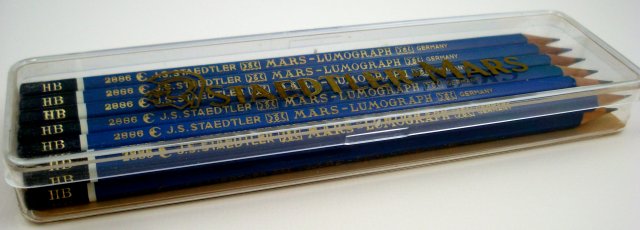
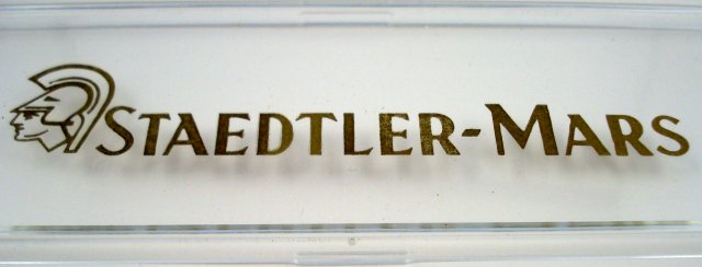
The lid has some compelling graphics:
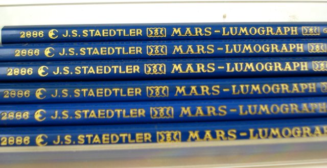
Half a century old, only the design indicates the age of these pencils:

The “A” in “STAEDTLER” appears to be formed like a compass. As well, reflecting the manufacturing processes of the era, there are slight surface differences between specimens.
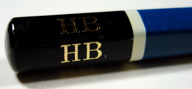
An element I love is the HB grade mark in vibrant gold colour. It is serious but not fanciful, like the painted gold markings that were once typically applied to wood surfaces such as office doors and library card catalogues.
The factory sharpening, just like the modern version, is the best in the industry, with no “scrape marks” along the wood.
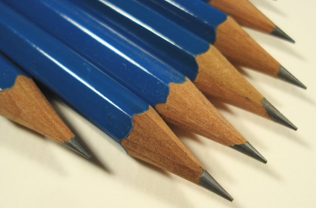
Take a close look. Even the smallest graphical details are impressive.

Overall, a classic pencil.
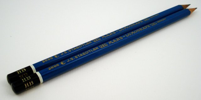
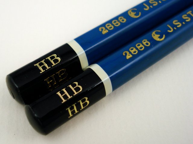
Are “MARS” and “LUMOGRAPH” rendered the same way?

For me, the caps are a continuing delight:

A comparison with the modern version. In case you didn’t notice, this photo should make clear that the 2886 is a “left-handed” imprint, in contrast with the standard “right-handed” 100.

Does anyone prefer the modern look?

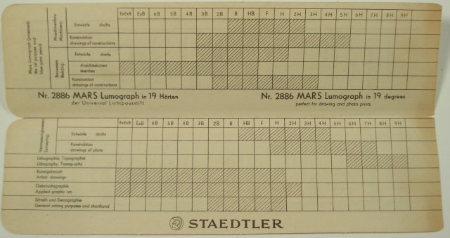
A small delight after all these years is to find a paper insert.

Slightly withered, it presents pencil grade recommendations for eleven different professions.
I have tried and tested the 2886, and find it to be extremely similar to the modern 100 in graphite function and erasure. Given the half century between the manufacture of the two pencils, this demonstration of Staedtler’s ongoing commitment to their product excellence is remarkable.