Top Japanese Pencils: The Mitsubishi Hi-uni and the Tombow Mono 100

Hello, it’s been a while since this blog has been online or updated. Good news: The server hosting the blog survived being in storage, and has again been cranked up and placed online!

Thank you to those who wrote notes of encouragement about the blog. They were definitely appreciated.

Even better news is that there are lots of things to write about. I thought I would start with two top Japanese pencils. A couple of years ago, these were very hard to acquire in North America. Thanks to the internet, they’re now possible (though still far from easy) to source.

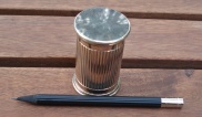
The intriguing cap of the Tombow Mono 100

The intriguing cap of the Tombow Mono 100


The Mitsubishi Hi-Uni is the top woodcase pencil in the Mitsubishi Pencil Company’s line. There seems to be no doubt that mechanical pencils are much more widely used in Japan, with woodcase pencils like these considered niche products.

This pencil’s packaging announces it – a light green cardboard sleeve with a cutout that lets one see a half dozen pencil crowns. Taking off the sleeve, there is a black plastic box with a clear plastic lid that pops up to allow access. The interior of the box has a many-spoked divider that keeps each of the twelve pencils separate. It’s heavier than any pencil box I’ve encountered, and definitely indicates that the contents are valuable.

The pencils are offered with a heavily varnished maroon finish, topped by a black crown. The stamping is gold, along with a white barcode. The pencils are also distinguished by the orange dot on their tops.
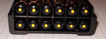
The intriguing cap of the Mitsubishi Hi-uni

The intriguing cap of the Mitsubishi Hi-uni


They sharpen easily, and in HB have a very rich dark lead that doesn’t crumble. On paper, the markings seem reasonably smear proof. I look forward to trying some other hardnesses. I haven’t spent too much time with them yet, but hope to soon give them a lengthier workout. I’ve found that some pencils which do well for a few jottings aren’t necessarily great all day writers.

The Tombow Mono 100 is a legend, especially in the animation field. It has a reputation as a high quality professional pencil. Dick Blick calls it the “gold standard.” I’ve spent quite a few dollars not getting this pencil – ordering it and being sent something else. Anyhow, I’m glad to finally have a few in my stash. They’re black, with gold band, and a white stripe that traverses the pencil’s cap.

They’re just a wee bit longer than any non-erasered pencil I have. A slight compensation for their price, I suppose.

They sharpen well, and like the Hi-uni, have a dark rich lead. I have tried them for a sufficient period of time to confirm that they make a great writer.

To my eye, the finish of both pencils is disappointing. Maybe I was expecting too much, but they’re overcrowded with too many font faces – both of them. A pencil just doesn’t have room for six different fonts without being very distracting. And of course the almost ubiquitous bar code makes them less sleek. They do have superior paint finishes, though.

Now as pencils – they’re really good. They seem to have the dark lead (the right combination of graphite, clay, wax, and other ingredients) that’s so pleasing to see on paper, without the crumbling or quick point erosion that some other attempts at dark leads have seen.
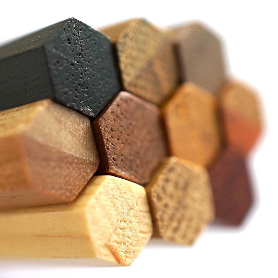
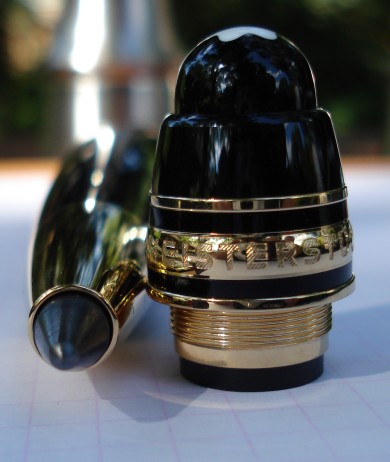
The Montblanc Leonardo Sketch Pen (Which is a pencil.)

Leonardo Sketch Pen
Is this the sexiest, most exciting pencil ever?

Years ago, an article in Pen World detailed the background of the wide lead clutch pencil resurgance. The invention and design of a new lead clutch mechanism was followed by success in selling it to the leading innovators in the writing implements trade.

The ultimate expession of that idea is the Leonardo Sketch Pen – which is a pencil. For me, it was a gift upon a special occasion. Not just a gift – an ubergift. You like whisky? Here’s a bottle of Ardbeg Provenance. You like cars? Here’s an Aston-Martin. And here’s what we have for pencils – the Montblanc Leonardo Sketch Pen.
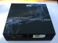
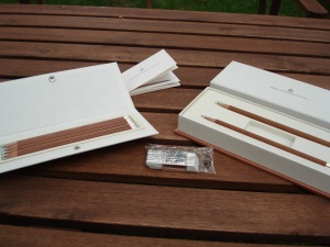
Leonardo Sketch Pen box
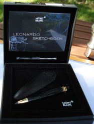
As befits such an object, it is beautifully packaged in a presentation box. The top half contains the manual, a small sketch book, and a refill lead. The lower half has the pencil and a protective leather case.
Leonardo Sketch Pen box opened
The pencil itself is beautiful – black and gold, with a heft and design that makes other clutch pencils look very pedestrian. It handles very nicely, and it really conveys a sense of luxury.
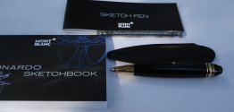
Leonardo Sketch Pen accessories
What’s it for? It’s not for writing an essay, but it is great for sketches, drawings, flowcharts, and small bits of jotting. The lead width and pencil heft make it easy to quickly draw any length line. The cap, itself a small work of art, contains a sharpener for pointing the lead. In practice, the lead’s width means that there will be various edges varying from thin to wide, for producing different types of lines. But the initial point stays sharp for quite a while with an HB lead. Montblanc also provides 4B leads for darker, richer lines, and of course one can use third-party leads.

I’ve never seen another pencil with such a “wow” factor. A year old, it’s still a thrill to use.

[A note to readers: This blog may soon be going offline for a while.]

Leave my Rhodia Pad alone!

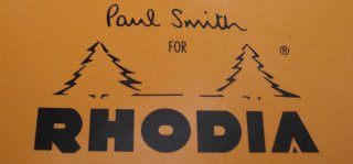
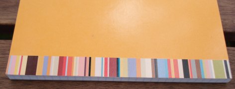
Paul Smith for Rhodia

One of the delights of the Rhodia pad as a product is it’s consistency – the iconic orange colour, the unchanging format and presentation, the year after year weekend newspaper reports “discovering” the writing pad manufactured for longer than most of us have been alive. So it’s alarming to see something different. What are these splashes of non-orange colour on my Rhodia pad?

It looks like Paul Smith has embellished a Rhodia Pad! Leave my Rhodia pad alone!

The Paul Smith version looks nice – no doubt – but brand managers should know that some of us just don’t want these classics tampered with.

Graf von Faber-Castell pencils.

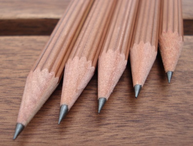
Graf von Faber-Castell pencil closeup.
Wow. I have wanted to write about these pencils for some while. They are the ultimate woodcase pencil. They have an incredible look, feel, and composition. They even smell nice, with an incredibly rich cedar fragrance.

They are sold in various formats, variants and packages, but here I’ll address only the full length standalone pencils. They are round with ribbed grooves, and have a silver-plate cap. Their circumference is larger than the typical office pencil. They look like finely crafted works of art, which incidentally happen to be pencils.
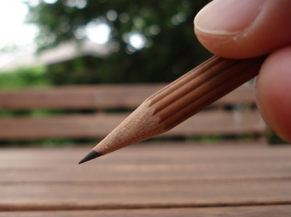
The Graf von Faber-Castell pencil on a picnic bench.
I’ve got a set of five, and also a set of two that came with a white eraser with ribbing that matches the pencils. The eraser also has a silver-plate cover. Until I can get some eraser replacements, I’m leaving the eraser in the plastic, as I don’t find that white erasers tend to stay white too long.
Various Graf von Faber-Castell pencils.
The series extends to silver-plate sharpeners. I have a large one that’s really a joy to use as a desk sharpener.
Graf von Faber-Castell Large Sharpener
The pencils are definitely top class, with a smooth writing dark lead. In one’s hand, they are very easy and pleasant to grip. They’re also beautiful and luxurious like no other woodcase pencil. Using this pencil is definitely enjoyable, and I recommend trying them to anyone who likes pencils.

International Arrivals Fluorescent Pencils

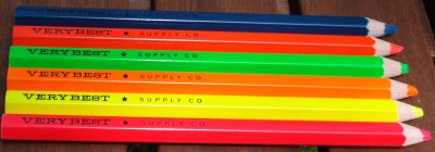
International Arrivals fluorescent pencils
I just saw these pencils at a new local stationer. The incredibly bright assortment of oversized hexagonal colour pencils was very eye catching.

The package identified them as “fluorescent pencils” from International Arrivals, and made in Taiwan. The pencils are marked “VERY BEST SUPPLY CO.” and the pencils are printed in the left-handed style. (The text readable when held in the left hand, unlike most pencils.)

I was told in the store that the pencils are for highlighting. This really pleased me, as I’ve wanted highlighting pencils for some time, but have never seen them for sale in a brick and mortar store.

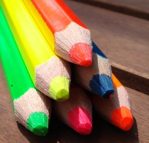
They are oversized hexagonal pencils, with an immense core. The pencils are varnished in very bright flourescent colours. The assortment seems uneven – yellow, dark blue, green, and three in the red-orange spectrum.
International Arrivals fluorescent pencils
As highlighters, I tested them on both bound books and laser printer output. The yellow, the traditional highlighter colour, was faint, and took a lot of pressure to leave any noticeable mark. The blue and green were slightly better, and the reds (which on paper turned out to be light pink, dark pink, and orange), were the most noticeable.

Needing a lot of pressure, and not leaving especially useful highlights, I’m not sure these really are “highlighting” pencils, like those from quality pencil companies. I think they’re just brightly painted, nicely packaged cheap pencil crayons. Which is is too bad, since they look so nice.

Natural Finish Pencils.

Naturalk Finish Pencils
The first natural finish woodcase pencil I saw or used was the Blackfeet Indian Pencil. By “natural finish”, I don’t mean unfinished, but rather a pencil with a clear or almost clear varnish that shows the natural grain of the pencil’s wood.

The Blackfeet is no longer made, and wasn’t widely available even at the height of it’s production. It was the first pencil I wrote about on this blog, and clearly has a following. Today, there is only one (which is more than zero) natural finish pencil I can buy locally – the Papermate Canadiana. That’s not a completely accurate statement if I include carpenter pencils. But, for general purpose writing, the Canadiana is alone.

Thanks to the wonders of the ‘net, I have been able to acquire a few more.

The Musgrave (by Musgrave) was unknown to me until offered on pencilthings.com. The first thing I thought was that is was a really traditional style pencil. The pencil is wider than most modern pencils, and most noticeably, the edges of the hexagonal shaped case are sharp – not rounded. It feels quite substantial in the hand relative to most pencils – the larger circumferance and the feel of the edges make it unique.

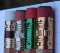
The lead is quite dark for a pencil marked as an HB. The finish is a highly varnished, shiny clear finish, with gold markings. The ferrule is gold and maroon, and the eraser white.

The California Republic Prospector has the roughest finish and worst looks of these pencils. I have several of them, and can see that there is little attempt to hide flaws in the wood. The varnish is thin and the pencil is rough and slightly uncomfortable to the hand. As a writer, the lead is a bit scratchy, though not bad. The gold lettering and ferrule don’t seem to work as design elements.

The Forest Choice is a Thai pencil. The almost-URL printed on one side makes it appear as an advertising item (which I suppose it is in some ways, except it wasn’t a freebie at a conference.) It’s sharp looking, with black stamping, an unshiny finish, and a green ferrule and pink eraser. It’s also a nice writer, with a dark smooth lead. The finish is very slick – it looks quite polished, yet doesn’t aim for the varnished looks of the other pencils. The finishing method must have been a bit different.

To see how these offerings compare with my old standy, the Blackfeet, I sharpened one up. A No. 2, it’s not as dark as the other pencils. It writes very well – it’s a really nice, special pencil. The lettering, the dark woodgrain, the history – I wish I had a few more.
Ferrule of Natural Finish Pencils
To me, there’s zero doubt about the best of these pencils. I love the Blackfeet, but the Musgrave writes so well, looks so sharp, and stands out so much that it’s a must have. Of couse, if you see a box of Blackfeet at a garage sale, don’t pass them up either.