The pencil is not a commodity – Economist article on Faber-Castell

It just came to my attention that the March 3rd Economist “Face Value” column had a full-page article on Count Anton Wolfgang von Faber-Castell and the Faber-Castell business. It’s a good read for anyone interested in the pencil business.

A few quick facts:

* F-C annual revenue is $US530M

* The Count owns 88% of the firm

* production is 2 billion pencils/year

* the debt to equity ratio is 50%

* there are sixteen manufacturing plants

* the expected growth market is in drawing as a hobby

On a personal note, happy Easter to those who are celebrating the holiday.

The Staple-less “Stapler”


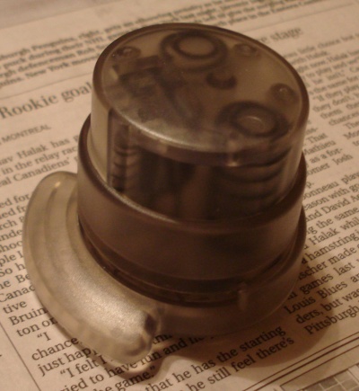
The Staple-less “Stapler” may not be an accurate name. It is a small paper binder that makes small cuts and folds in two or more paper sheets, creating a tucked loop that holds the sheets together.

The main negatives I can see are that it isn’t good for too many sheets, and it isn’t as permanent as a stapler. But on the plus side, it won’t cut your finger, it doesn’t need staples or any other type of refill, there is no rust on your documents after time, and it’s cheap, lightweight, and portable. What’s not to like?

I got one a few months ago, and have found it to be a reliable and useful desk accessory. It is perfect for quickly attaching a few pages.

Faber-Castell Design Pencil


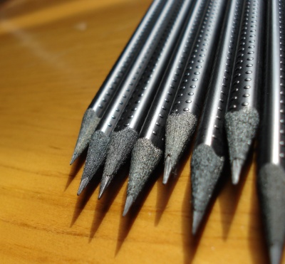
Faber-Castell has released a “Design Pencil” that is indeed the embodiment of design.

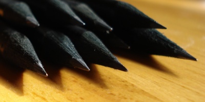
It is a fantastically good looking black triangular pencil, with black dyed wood. Like it’s elder cousin, the Grip 2001, it has raised dots on the side, though here they are smaller and beneath the surface paint. Markings are thankfully kept to a minimum, with only “Faber-Castell” and a small logo written on one side in grey.

In a B grade, it is very pleasant to hold and use. The lead is very strong and non-crumbling.

While I like Nava‘s pencils for appearance, this new creation has again demonstrated Faber-Castell’s industry leadership and ability to keep taking pencil design and presentation to higher levels.

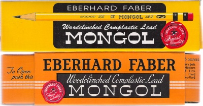
The Mongol 482: New and Old

The Mongol is one of those classic pencils that conjures up fond memories for many.

While often thought to be no longer made, a post at the excellent Timberlines blog shed much light on branding in the global pencil industry, and the fact that these pencils are still alive and kicking on two continents!

A second event happened – online retailer PencilThings started carrying the Amspec version, making the Mongol available to those of us who miss the original, and those of us who missed the original!

About the pencils – both new and old are a goldish yellow with black stamping. As well, they both have markings pressure-pressed (no paint used) on their cases.

The Mongol’s ferrule – two tone with a middle brass coloured ring – is considered unique and interesting. The new Mongol is certainly very shiny. The original not so much. After decades in the box, this is understandable. It looks like the original ferrule might be constructed out of two pieces of metal, but I’m not going to break it apart to find the truth.

The pencils have these markings:

Old Mongol:

Obverse: [Woodclinched Complastic Lead] MONGOL * Eberhard Faber U.S.A. 482 – No. 2 –

New Mongol:

Obverse: [Woodclinched made in Phil.] EF Mongol 482 2 K6

The square braces indicate stamped text, with no paint used. I appreciated the restraint in not covering more edges with text.

The new Mongol has a quite bright pink/red eraser – the brightest I’ve seen outside of novelty pencils. It actually works quite well, which surprised me. The eraser on the original is dried up, and wouldn’t erase anything.

I wasn’t sure what to expect when sharpening the old Mongol, but the results were pleasing. The wood remained pliable after all these years, and there was no problem at all sharpening the pencil. I immediately put it to paper, and thought “Wow, it’s true, they did make them better in the old days.” The lead is rich and smooth. Though a “No. 2”, it’s more like a 2B by modern standards.

The Amspec Mongol also sharpens easily. It’s not at all a bad pencil – in fact it’s rather nice. But having just used the excellent vintage version, this newer model is markedly more scratchy and rough on paper. Perhaps related to the smoothness, the vintage pencil seems just a shade darker.

Verdict: The original based on superior lead quality.

Some Links of Interest:
Mongol 482 from Sanford Venezuela
Mongol 482 from Amspec Phillipines
Mongol Pencils at Pencil Pages – Many Photos

Kita-Boshi HIT No. 9900 pencil

Kita Boshi PencilsWhile Mitsubishi, Tombow, and Pentel may be better known in the west, there is at least one more quality Japanese pencil manufacturer of note: Kita Boshi.

The Japanese pencil industry website tells me of many other companies in the industry, but Kita-Boshi are the only one of these whose products I have been able to source.

I am not sure what is going on, because two different grades of the HIT No. 9900 appear to be different pencils, despite the same name and model number.

The 4B is round with an unfinished cap, and black with gold stamping. There is a gold band near the cap. It has these markings:

Obverse: Kita-Boshi HIT [8 Japanese Characters] 4B
Reverse: For Draftmen, Designers, Copy-writers No. 9900 4B

The HB is hexagonal, with colourings I have never seen in a pencil: Brown with gold stamping, and a green band near the cap.

It is marked:

Obverse: Highest Quality * KITABOSHI * HIT * HB
Reverse: For Retouching & Special Drawing No. 9900 HB

Another difference: The 4B core is approximately 50% wider than the HB core.

I can imagine the sincere but slightly awkward slogan “For Draftmen, Designers, Copy-writers” being enjoyed by many, though less so by Draftsmen and Draftswomen.

Both pencils, like the Pentel, have matte rather than glossy finishes. This is fine with me, and is quite pleasing. It is a quality finish, while being quite practical.

Both pencils sharpen easily, and lay down rich smooth dark lines. The 4B is almost unique as far as I know in being a round pencil at that grade. Its wide core, good looks, and quality graphite would truly make it a “hit” if it was more widely available.

The HB is very good in its category. The standards of Japanese woodcase pencils are very high, and this pencil doesn’t disappoint. It looks good, writes well, and while not as rich as the Mono 100 or Hi-Uni, still lays down a line better than most pencils.
Pentel Black Polymer 999


In addition to Tombow and Mitsubishi, there are other quality Japanese pencil manufacturers. One of these is Pentel. Their top of the line pencil in the Black Polymer series is the 999 alpha. I’ve heard they are great, but have been unable to acquire any. (If you have some for sale, please let me know!) But, I did come across some of their still very fine 2nd rank pencil, the 999.

Distinguishing the two pencils is easy – the 999 alpha has the Greek alpha character in the pencil name, and the slogan “supreme quality for lines of highest density.” It has a glossy finish with the grade printed in black on a silver background. The regular 999 has the more modest slogan “the highest quality for general use”, and less use of silver. The finish is matte, and the top of the cap is painted silver.

Matte vs. glossy sounds like a photo finishing or interior wall paint choice. But it seems it’s also a pencil choice, and Pentel chose matte for the 999. It is very pleasant to hold, looks good, and is not too common in pencils. I have some Lyra pencils with a similar finish, and can’t think of any other manufacturers that have chosen this type of finish. The silver accents on black paint make it one of the most attractive on the market – up there with the Grip 2001 and Nava.

The box it comes in also looks nice for a cardboard box – there is something very adult and stylish about the presentation.

The pencils sharpen easily. The lead is not as rich as that of the other Japanese pencils mentioned here, but still nicer than average. It makes an excellent writing pencil, and goes very nicely with a black journal.