Pencil packaging graphics were truly amazing some years ago. This post is more a look at some particular artwork rather an exploration of the pencils.
The seams of this box have largely disintegrated:
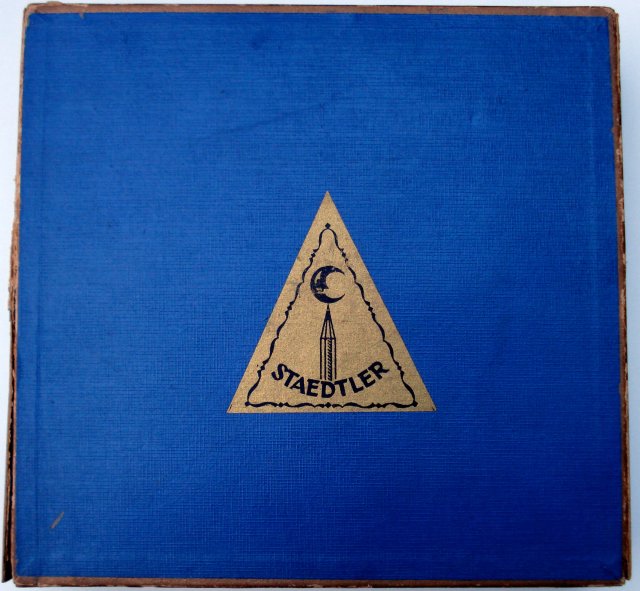
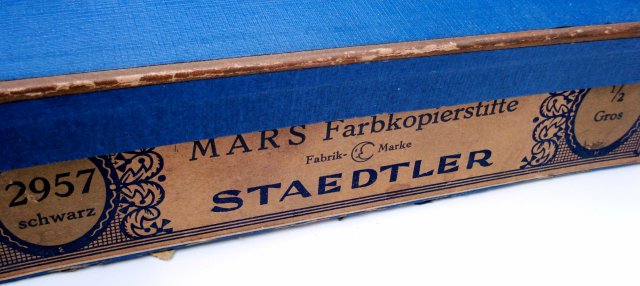
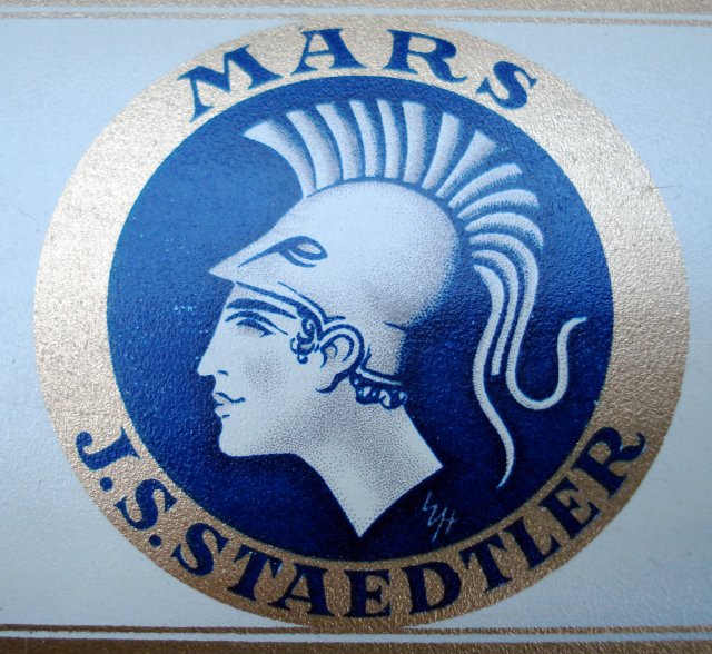
One side of the bottom has a label:
While the box itself has some nostalgic appeal, a gem is hidden on the inside lid:
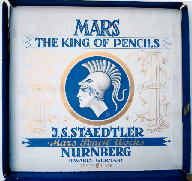
Notice the “since 1662” phrase also. Staedtler now claims an 1835 origin.
The tins of pencils are themselves quite something:
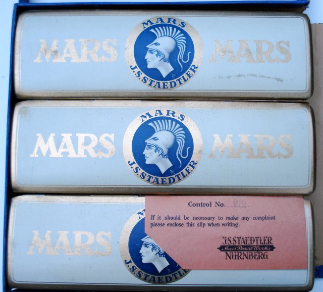
I am glad to see the artist’s initials, “W.H.”
Due to the relatively large size of these images, I’ll wait until the next post to show the inside of the box.
Beautiful product artwork indeed. It would be nice if this type of packaging were to experience some sort of revival. Yet sadly this seems to be the kind of fashion that do not tend to return.
I agree with Alberto. Compare this to the boring artwork on the tins of Staedtler today…
Just wonderful! I like the crescent balancing on the moon – and the blue is beautiful. I wonder why they changed the 1662 origin.
According to wikipedia and the Staedtler site, Johann Staedtler founded the company in 1834. Both histories refer to a Friedrich Staedtler who is recorded as a pencil maker in Nuremberg in 1662. The comapny claims Friedrich is an ancestor of Johann’s – probably is.
Alberto, maybe it’ll be your artwork on the tins – good luck in the contest.
I agree, the artwork on the packaging is very pretty. Much different than the current art on the current Staedtler tins. I think one of the reasons why the packaging is no longer as elaborate is due to cost. Pencils are a commodity, so the profit margin is less now.
The packaging is great, especially the tins with their vaulted lid (as far as I know they became flat in the 1950’s).