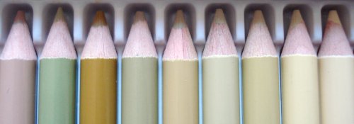
Here is the second set of pencils from Felissimo’s series of 500 colors.
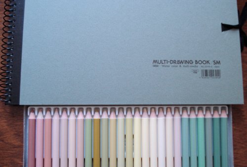
Again, the packaging is impressive:
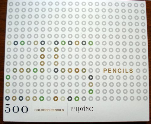
This month’s palette is hard to describe in a single word – the focus is on muted pinks, creams, pea greens, and mint greens. I was somehow expecting something like last month’s bright reds – perhaps another set of bright primaries, but also welcome this surprise.
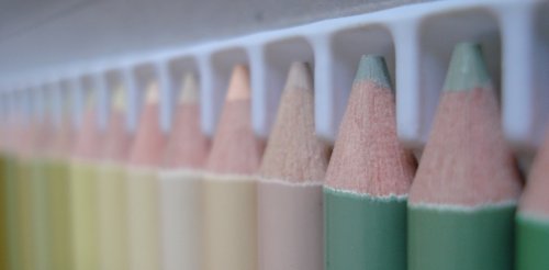
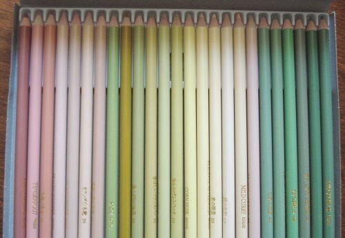
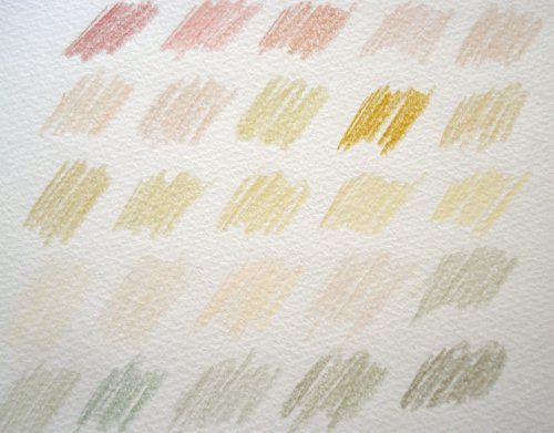
I did try them out, and realized that the pencil pigments are much subtler than the lacquers on the pencil surfaces – matching 500 sets of pigments with 500 surface lacquers must be a significant part of the manufacturing challenge.
That ninth pencil, called Mrs. Parson, stands out in both surface lacquer and on paper.
There were a few questions after last month’s post on the first set, and I recommend that those interested take a look at Felissimo’s “Frequently Asked Questions” page via the banner below. For example, on the issue of lightfastness, Felissimo state that a small sample of pencils have been tested, and all are 4/5 or 5/5 on the JIS lightfastness scale. JIS is the Japanese Industrial Standards section of the Japanese Standards Association. While probably insufficient data for professional artists, I think this speaks well about the pencils from the quality persective.
I can’t wait to see what the next 25 pencils look like!
See also:
Hi, I really liked all the information that are shown here. I am a big fan of pencils because I do sketching and drawings and I write on my journal using pencils. ^_^ Thank you very much, I am inspired now to use my pencil.