I hope you like the blog’s updated appearance! Please let me know if you discover any problems.
There are a few changes behind the scenes as well. The categories and indexing have been neglected for too long, making the content less accessible than it should be. I’ve gone through the first two years of the blog, and have attempted to accurately categorize each post. I’ll keep working on this.
As a small celebration, here’s a contest: The blog’s “banner” is the rectangular photo at the top of each page. Until yesterday, that banner showed green erasers from the FSC Canada pencil. Can you identify the pencil that was shown on the first banner used by this blog?
The prize:
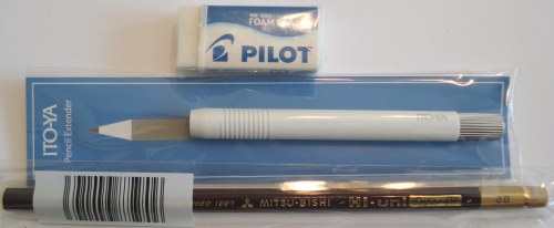
A Pilot Foam eraser, a Mitsubishi Hi-Uni Super-DX pencil, and an Ito-ya pencil extender in white.

Just leave a comment with the answer. The first correct answer wins. (The winner can send me their postal address via email, and the prize will be sent via Canada Post.) The contest runs until midnight on June 23, EDT.

Was it perhaps the LYRA Dessin No. 2 and theLYRA No. 92 Steinhauerstift seen here:
https://www.penciltalk.org/wp-content/themes/default/images/penciltalk.header.jpg
Good guess, but no – it is an earlier image.
That sounds a bit ambiguous. Let me clarify – the first banner image predates the one Luke mentions.
blackfeet indian?
Couple of minor technical points. The little Pencil Talk image / logo in the top left before the Pencil Talk wording doesn’t display on my PC at home or at work, both using IE7.
Text doesn’t justify left in the 4 x Leave a Reply fields.
Loads just fine for me in Opera, Google Chrome, the much hated (by me) Internet Explorer and in my fav, FireFox. FYI, I was loading the most current release of each browser noted. In all the page collapses well and maintains integrity to a fairly small crunch, including the banner. All text flows correctly in all cases, for me anyway.
Which I could take a shot at the contest but I’ve only been with you for a year and I think this is my first comment. It’s a great blog. I read mainly by RSS feed.
Sam, not a bad guess. The Blackfeet Indian was the first pencil mentioned when the blog was started, and that post remains popular.
Kiwi-d, thanks for the feedback. I just did some searching on the text justification issue, and it seems to be a known issue. I have made a minor tweak, which I hope you might be able to test. (It may require that you clear the browser of any cache and/or cookies from penciltalk.org.)
The little logo might have some other requirements. I tried not using one, but that also mucked up the display. Not having a logo – I am trying to use a small .jpg file. I just switched it to a slightly larger image.
Owen, thanks for the testing and feedback. Welcome, I am glad you like the blog.
Logo and justification problems appear to have been fixed.
Thanks.
Thanks for the feedback! Most appreciated.
Really nice makeover – like it! I could be wrong :-) but I remember some Graf v FaberCastell pencils in your banner back then?
Henrik
I think the photo comes from this article:
https://www.penciltalk.org/2006/06/natural-finish-pencils
And here is the photo itself:
https://www.penciltalk.org/images/ferrules.jpg
So the pencils would be:
Musgrave
The Blackfleet Indian pencil
Forest Choice
California Republic Prospector
Was it group of Forest Choice Pencils? Or was it the Mont Blanc ‘Leonardo’ clutch pencil?
Are two guesses allowed?
Great site, and an excellent resource!
Henrik, thank you, but no.
Greystoke, interesting, but that hasn’t been a banner photo either.
Donnie, one guess would be preferred. I do like the look of the Leonardo pencil, but it wasn’t in the banner.
I have no response to the question, but was wondering, where can I buy an Ito-ya pencil extender like the one pictured?
Sorry, I misinterpreted the word “banner” :)
I would have guessed the same as Luke. What about Rhodia pencils?
Drew, Ito-ya (Tokyo) sells these extenders.
Greystoke, no problem, and I realize that “banner” is a bit of a jargon term.
Patrick, also a good guess, but no.
Images you post on the new layout (pencils, etc) push out into the right hand column and get overlapped by the text/links there. For example, on this page the silver part of the white pencil holder is overlapped with Bleistifte.
Thanks. The contest is over with no winner. The first banner showed the Faber-Castell Grip 2001 pencil. The second banner showed half-gross boxes of vintage pencils. This was before the domain name was registered.
We’ve had three previous contests, all quickly ended, so I wanted to choose a challenging question – but this may have been a bit too challenging.
Banners one, two, and three:
well, another contest I didn’t win – but I was this close ;)
Thanks Penciladmin.
I like the old look better, it was more.. casual and inviting. But that is my opinion
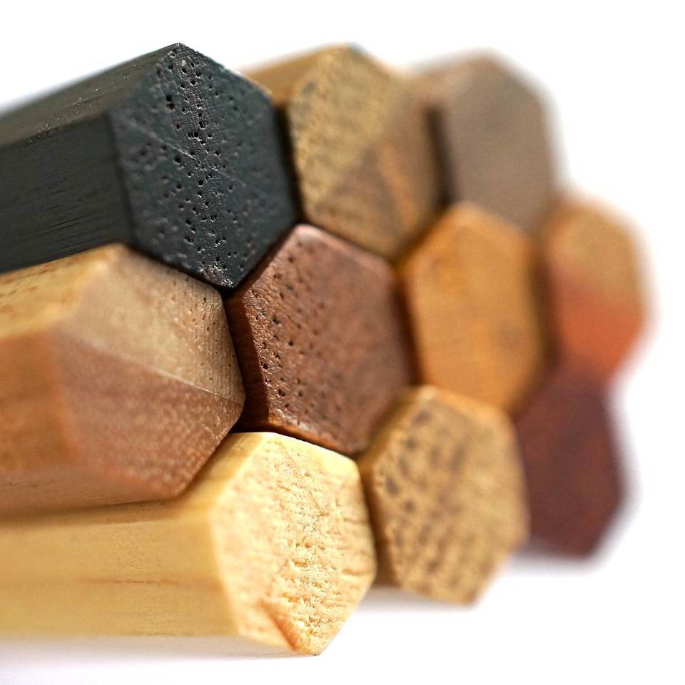
Those appear to be limited edition Colleen pencils that showed various wood types…
doh… now it changes and I’m too late anyways… stupid work getting in the way…
Hi Paul, thanks for the comment – there are always choices to be made. The previous layout fixed the width of the text area at a certain number of pixels. This is now scalable/flexible, but it also means that there is a problem if you make the windows too narrow.
Hi Omar – the feedback is appreciated.